For anyone doing Content Marketing, it’s no surprise that creating enough really good content remains a persistent challenge.
Yet, recent research from CMI of over 5,000 marketers reveals that 70% of B2B marketers are creating more content than they did last year. Surprisingly, even those marketers who don’t have a documented strategy or describe themselves as not very effective with Content Marketing plan on investing even more in the upcoming year.
Are you publishing content that’s long enough?
The most used Content Marketing tactics today include social media posts and e-newsletters. But content that B2B buyers value the most include longer-form blog posts, articles, case studies, technical guides, white papers and research reports.
So if you’re strategy is dependent on producing and deploying more of these content types, it’s reasonable to ask “How long should a blog post be? ” —number of words.
Ignore the search algorithm at your peril.
Before we get to the magic number of optimum content length, it’s important to consider how this ever-growing amount of content will get found through search.
Text is what search engines know and understand. The underlying software is simply unable to recognize or discern one image from another. That includes video too.
So if you use images alone for important content concepts or links on your site, you put yourself at risk of not being found in a search query. That’s because your content is not talking to the search algorithm’s language.
Google’s webmaster guidelines make the importance of text explicit with this disclosure:
Try to use text instead of images to display important names, content, or links. The Google crawler doesn’t recognize text contained in images. If you must use images for textual content, consider using the ALT attribute to include a few words of descriptive text.
As you plan your content, consider following these guidelines:
- | If the content’s critical, publish it in text—period
- | A website optimized for the visually impaired will be understood + found by search engines
- | Every image should have an alternate text tag or attribute
- | Fewer images in your content means faster loading webpages
- | Faster pages provide a better customer experience—especially on mobile devices
To get found, short content falls short.
If you want to increase site traffic and improve your content marketing effectiveness, a high volume of short, 400-word posts just won’t cut it anymore.
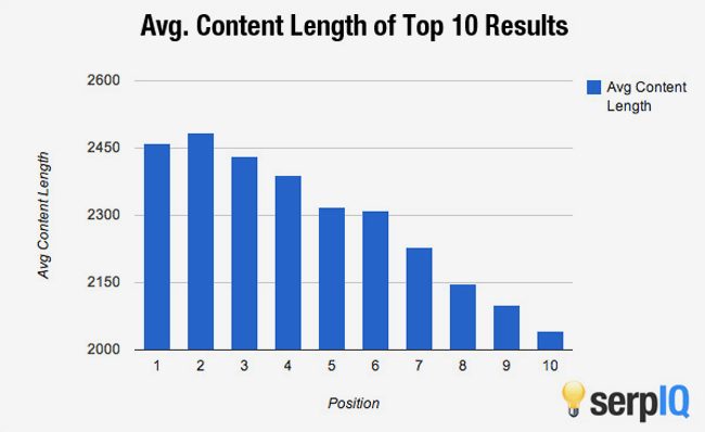
In fact, a recent study by serpIQ found that longer content ranks higher in the Google search results than shorter content. What’s more, to rank in the top 10 search results today, your content will need to be at least 2,000 words in length.
That might sound like a bit more work than you’ve been accustomed to. But longer-form content that’s conceived for the middle of the sales funnel to nurture leads is well worth the added effort. The reasons include helping you get more social shares and increasing the opportunity for more inbound links.
Sharing 2000 valuable words starts with 140 characters.
Content that’s more than 3,000 words is shared 2—3X more than content that’s less than 1,000 words. That’s because an embedded link in a social share should be intended to enhance the message in the social network where it’s delivered.
If a fan or follower clicks on an embedded link and they end up at a “thin” piece of content that doesn’t expand on the core message or benefit in the “share”, the result is a site visitor “let down” with a stingy piece of content.
Another benefit to longer-form content is that it’s much more effective at delivering inbound links. And as any SEO geek will tell you, more high-quality inbound links improve a domain’s authority. And domains with higher authority usually deliver a higher position on a SERP | Search Engine Results Position. Isn’t that where you want to be?
Take the long view of improving content. And your image.
During the height of the adage, legend David Ogilvy conducted research into the effective use of images with ad copy. He wanted to ensure that the images he was using in his print ads would increase retention and response rates. In his day, the prevailing wisdom was that any image would attract attention, and therefore get people to read on.
It’s important to note that Ogilvy’s ads looked surprisingly like a lot of today’s online content. That’s because they were consciously crafted to look like news articles—think long copy.
What Ogilvy discovered in his research revolves around broad psychological principles, rather than just specific tactics. His findings summarized below, apply not only to ad copy but to online content too.
Ogilvy’s findings and more.
1 | Put the picture where it counts
The natural sequence of reading involves a very specific order. And it looks like this:
- We’re attracted to a featured image—if there is one
- We scan the headline
- We read the body copy (if the combined headline and visual together are provoking or interesting)
To catch people’s attention and draw them into an article, it’s common practice to place an image at the top of a page. Ogilvy found that, on average, headlines placed below a primary image are read by 10% more people than headlines positioned above a featured image.
And since reading the headline is a prerequisite of reading the rest of the content, you risk losing 10% of you potential audience if you’re distracting them with an image in the wrong position.
2 | Let the subheads do the heavy lifting
As William Strunk and E.B White point out in the writing structure classic, Elements of Style, it’s essential to have an idea of how you want your text to look—before you publish.
Without a doubt, the text is a visual component on a page—even a web page. Therefore, writing and composing it in a way that invites readers to look at it, and skim it in digestible chunks will improve both engagement with it and retention of it.
That’s where subheads come in. These hard-working structural components can tell the whole story of your long-form content in a few, well-crafted and prominently emphasized words placed throughout your content. Think H2 + H3 HTML tags. For old schoolers, that’s larger, bold text.
3 | Put captions to work
Newspapers have long understood the value of captions for drawing readers in, delivering a message and summarizing the primary “take-away” of an article. Unfortunately, this simple, proven tactic is often dismissed by today’s web designers and content marketers.
An image placed in the middle of an article or post captures the reader’s attention much more than a sea of small grey text. So why not put a caption under your secondary images? When you do, you can emphasize your main message or benefits and hopefully, get your site visitor interested in reading on.
Captions under images are read, on average, 300% more than the body copy itself. So not using them, or using them incorrectly, means missing out on an opportunity to engage a huge number of potential readers. Because captions can do so much to inform readers quickly, it’s essential to create them with the same care and thought as you would craft your primary headline.
4 | Don’t buck convention
When we read, we rely on the left margin always being there as an anchor. It gives readers a place to return their eyes without being disrupted. Without a consistent left margin, it’s can be challenging to follow the text.
That’s why body copy is rarely justified to the center or right in the Western world. If the location of the left margin moves around, we have to relocate it before we can continue reading. Our eye path is interrupted, along with our train of thought. So avoid the vision gymnastics and keep it simple with a consistently aligned margin that makes content easy to read.
5 | Less is more
If you use images that aren’t clearly tied to the benefit or primary message of your content, then they’ll only confuse your readers. In fact, they could give the wrong impression and lead readers to feel tricked or worse—feel ticked off.
The best kinds of images to use in your content fall into two categories:
- | Images that enhance story appeal
- | Images which demonstrate
An image with story appeal is best for putting it above your headline. It should evoke a strong sense of curiosity or emotion in your reader. Engaging images like this cause a reader to want to know more about what’s going on and hopefully, inspire them to read on.
An image that demonstrates is exactly as it sounds. It demonstrates and underscores something you’ve stated in your content. Before and after images and progress graphs are good examples of this.
Short and sweet alone comes up short.
The short story on long content is that substance matters more than ever today. Because quality performs better than quantity.
So forget just sharing your tweets or 200-word posts on your blog and get serious about creating more long-form content that will deliver the results you’re looking for. It may take more effort or resources but your readers and the search results will reward your effort.
Are you still hoping short content will improve your online marketing performance? Or have you taken the longer content path? Time to share.

As president and creative director of TeamworksCom, Paul develops brand strategy, engineers content to express customer value and creates integrated online and content marketing solutions to help businesses succeed. Connect with Paul, send an Email, or just call 415.789.5830.
[…] legend David Olgivy understood that people read headlines first. And if the headline doesn’t grab reader attention or interest, […]
[…] Content […]