If it’s not painfully obvious, you’re website should be your most valuable business asset for marketing a product or service online. And before we get into the details on how to convert more traffic into leads with a well-constructed landing page, some context would be appropriate.
If you’ve worked with the right partner to position, write, design, optimize and deploy a site that’s at the center of a content marketing strategy, how can you ensure that your website is working as hard as it should to nurture prospects, close sales and increase revenue?
If Content Marketing’s your game, a Landing Page must be your thing.
Today, attracting and capturing leads online requires a comprehensive Content Marketing strategy. As a result, this means you have to consistently produce and deploy high-quality, search optimized and widely distributed content that addresses your prospects needs and challenges.
What’s more, your content needs to be planned, conceived and structured in the form of campaigns that you can track, measure and improve with certainty. These campaigns, and all of the content in them can include:
- | Posts
- | Social
- | PPC
- | Paid Social
- | Guest Posts
- | Unique site pages
- | And more
Campaigns should be developed and deployed to have the recipient take a SINGLE action. And that action needs to take place on a LANDING PAGE.
What exactly is a Landing Page?
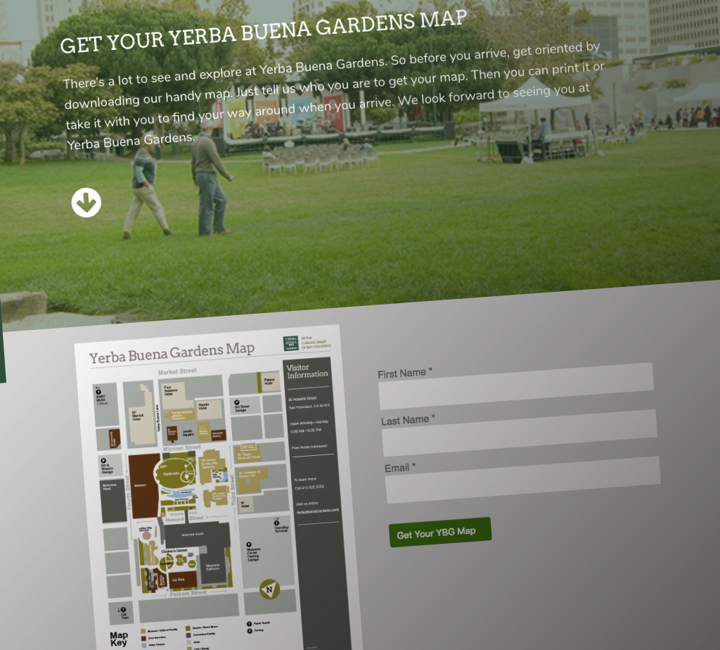
A landing page is a unique web page that’s conceived and designed to get visitors to do only one thing. However, getting your website visitor to take a single, specific action is anything but easy.

Today, people are overwhelmed online, attention spans are shrinking to new lows, and online distractions are increasing like never before. No doubt, you’ve personally experienced that in your daily use of the internet.
Examples of specific actions which can be driven by a landing page include:
- | Capture email address
- | Download asset
- | Register for webinar
- | Take advantage of limited-time-offer
- | Sign up for event
- | Save on purchase
- | Enroll in sweepstakes
- | Renew subscription
- | And lots more
Once again, a landing page should be solely focused on a single goal. So being clear on what that goal is before you conceive, develop and deploy your landing page is essential.
How to build a well constructed Landing Page.
The guidelines below provide an overview of how to make your landing page as effective as possible to achieve your single goal.
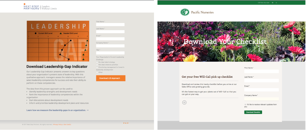
Landing pages can be very different visually. And their form is often driven by a brand’s identity guidelines, the website where it’s deployed and the data that’s required for capture and analysis.
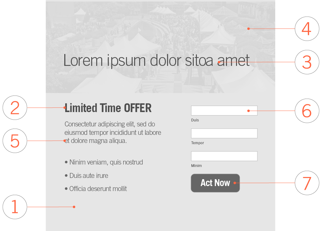
However, all landing pages, regardless of who they are aimed at or whatever their goal is, need to include ALL SEVEN of the components below to be successful.

1. | Simple + clean
A landing page layout needs to be as simple as possible. If we haven’t already made this clear, the focus should be on a single action. The layout and design of your page will impact results.
So, if you want lots of conversions on your landing page, lose the clutter and limit your use of every tool or trick in your digital graphic arts creativity box. You don’t want to distract. You want to drive action.
Before you do anything else, remove extraneous content elements on your landing page including:
- | Navigation
- | Sidebar
- | Footer
The adage LESS IS MORE has never been more applicable. Both the page design and copy need to be laser-focused on achieving the one single outcome that you’re looking for.
2. | A compelling offer
Action has a price. And if you want better action by your site visitors, you need to offer them something that’s compelling, timely and that uniquely addresses pain or barrier that they are seeking to overcome.
If your offer doesn’t seem attractive to you, it probably won’t be compelling for your audience. Make it count and offer something your target really needs.
3. | A benefit-oriented headline
This is the first thing people read and must clearly outline exactly what you’re offering. Your headline must be short and well-crafted to convince your page visitors that your offer will benefit them.
Writing a benefit-oriented and convincing headline is anything but easy. A good place to start is by answering the question that every landing page visitor has: “What’s in it for me?”.
Avoid a clear answer and it’s a virtual guarantee that your landing page won’t measure up to your conversion expectations.
4. | A well crafted visual
All images should be high-quality and should complement your benefit message. Goofy graphics or poor visuals will distract or hinder the page visitor from taking the action that you seek.
Bottom line, if it looks lame fix it before it’s a performance disappointment.
5. | Copy that supports the benefit
Your message should be short, sweet, and focused on the details of your offer and how it benefits your targeted visitor. Using bulleted lists, short paragraphs and clear subheads will help you structure your copy. Overly wordy, or excessive copy length is out of place on a landing page.
Get to the point and let the reader understand your offer so that they can make their conversion decision in as little time as possible. Your copy must support the reason to take action. So highlight ONLY those elements, features or details that disclose more about what you’re offering and how it enhances the benefit.

6. | Data Capture Form
Your landing page needs to integrate a form that serves as a data capture and verification mechanism. An embedded form on a landing page allows a site visitor to enter data that is sent to a server for capture and processing. Online forms can resemble paper forms because visitors fill out the form using checkboxes, radio buttons, or text fields. Forms can be used to capture a wide variety of data including email addresses, preferences, promotional codes, and much more.
There are many methods to integrate a form into a landing page including 3rd party applications, plugins or a full-featured marketing automation platform. Deploying forms into a landing page should be integrated with a single database and all other online marketing functions in order to provide real-time results with alerts and other essential automation functions.
Connecting a form data capture database with a different email marketing database or a lead qualification database can be extremely challenging. The result is exposure to unnecessary technical difficulties, or worse, lost data.
7. | Call-to-Action
A call to action has to be persuasive. This is the element that users click to take action. In most cases, the CTA is represented by a BUTTON that the site visitor clicks on to submit the information that they’ve entered in a short form.
Once again, proving a clear, convincing benefit at the end of your landing page gives visitors a reason to populate your form and click the CTA button.
Always further a nascent relationship.
The best time to further a relationship with an engaged site visitor is when they’ve just converted by submitting the information you’re looking for in a form. A post-conversion landing page will fulfill this task.
Once your site visitor has clicked your call-to-action on the landing page, it’s extremely effective to follow up with them automatically with another message or offer. This can include:
- | Request for a demo
- | Subscribe to newsletter
- | Save on additional items—like a warranty
- | Cross sell or upsell
Whatever you choose to offer, there’s no better time to nurture your visitor than when they’ve already made an investment in your landing page offer. If you feel that this may be offensive to your converted visitors, or if this all sounds too hard sell, sending a sincere ‘THANK YOU’—in whatever media you choose—can often be just as effective.
Test to improve Landing Page conversions.
For the greatest ROI on your investment in landing pages, test and optimize them to maximize conversion rates.
Once you’ve created a landing page, the work has just begun. That’s because landing pages are rarely as good as they can be right out of the gate. So to increase their effectiveness and conversion rate, perform thorough testing and optimization of the landing page.
What’s worth testing on a Landing Page?
Effective landing page testing can include variations on these components:
- | Headline
- | Featured Image
- | Copy
- | Call-to-Action
- | Button location + size
- | Page Background
- | Font + size
- | Position + design of all of the above
- | And more
The two primary approaches of testing and optimizing a landing page include:
- | A/B Testing
- | Multivariate Testing

ABC’s of A/B Testing.
A/B testing is also known as split testing. It involves comparing two versions of the same web page where one single element has been changed to see which performs better. For example, you might test two different headlines on a landing page to understand which one performs better.
Get clear on which headline is more effective.
By carrying out an A/B test you would show variant A (the original landing page) to half your audience. Variant B (an identical landing page but with a different headline) would be displayed to the other half. Whichever has a higher conversion rate is the winner.
More variables yield better insights.
Multivariate testing involves testing multiple combinations of variables to see which performs the best. For example, you might test a new headline, a new image, and a new CTA, all at the same time.
As a result, your site visitors might be shown one of three, five or eight options of your landing page depending on the number of variables you’re testing. Since you can test several variables at once, multivariate testing provides insights and valuable conversion data more quickly than A/B testing.
Let go of SEO for your Landing Page.
In most cases, it’s not necessary to optimize your landing page for SEO. That’s right. It’s one of the few instances where you can leave this function to all of the traffic generating tactics that precede the landing page like pages, posts, emails, social posts, referral pages and more.
Directing search visitors to a landing page that is not preceded by a richer or more detailed email, page or post that provides context and value to your visitors is not a good idea. These are the pages and content that should be optimized for search and keyword terms that will help searchers find the value that they’re looking for.
How do you increase website traffic for Landing Page tests?
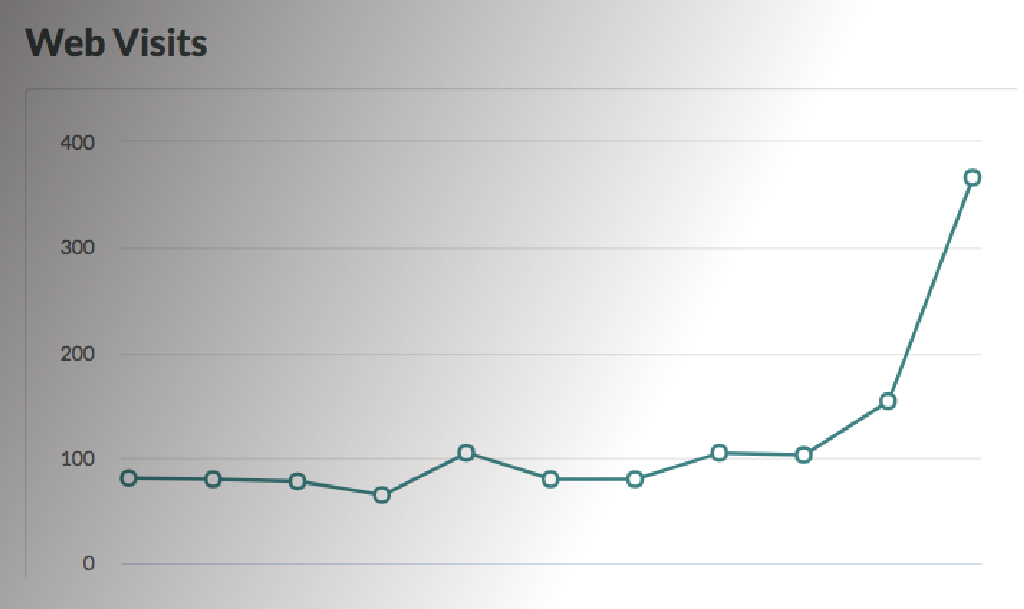
Once you’ve decided to test, you’ll need to drive traffic to your landing pages. Because without traffic, you’ll never have an adequate number of conversions to measure your test results.
How do you get more traffic to your site? Below are four suggestions worth considering.

1. | Put your website to work
If your website is already receiving a significant amount of traffic, you can use links or featured areas throughout your site to direct users to your landing pages. This can be done through CTAs in your website’s sidebar, on product pages or at the bottom of blog pages. This may be less effective for websites that have little traffic.
2. | Compliment SEO with paid search ads
Google Adwords is one the most common methods of directing traffic to a landing page. Paid advertisements on social platforms like Facebook or Twitter can also help boost traffic volume.
3. | Market to your subscribers + list members
Email marketing campaigns are great ways to get more visitors to your landing pages. Because the people on your email list may already be familiar with your brand and your product or service, conversion rates should be higher when you use this marketing tactic.
4. | Use social media for reach
Sharing posts in social media with embedded links to your landing pages can also drive traffic from your fans or followers. Even better, well crafted posts can encourage others in a social community to share your posts and thereby expand the reach of your content. The result is potentially more traffic from members in social communities outside of the members of your social tribe.
If your #Landing #Page is ugly, confusing or too busy, fix it before it’s too late. https://t.co/FGACK7GKI6
— Paul Pruneau (@Paul_Pruneau) June 15, 2018
Got it?
Landing pages are essential for conversions. So always do the following:
- | Build them with all of the right components
- | Test often
- | Share in campaigns to drive traffic to them
With persistence and consistency, you should begin to see improved results of the single goal that you designed your landing page to accomplish.
Looking for a better online marketing outcome?
If you’re looking for a qualified and certified resource to help you develop an effective Content Marketing strategy that integrates campaigns, quality content, landing pages, analytics and more, we can help.
To learn more about our strategic approach to integrated online marketing, contact us online or just give us a call at 415.789.5830.
As president and creative director of TeamworksCom, Paul develops brand strategy, engineers content to express customer value and creates integrated online and content marketing solutions to help businesses succeed. Connect with Paul, send an Email, or just call 415.789.5830.
